by Brian Johnson
Custom controls have revolutionized Windows programming. If you're new to programming, you might not appreciate the impact custom controls have had on software development. In this chapter, you'll examine the ways ActiveX controls can be used to enhance your Web development efforts.
ActiveX custom controls, or OCXs, are the 32-bit descendants of the dynamic link library (DLL) and, more recently, the Visual Basic Control (VBX). In order to understand these controls and what they do, it might help to take a brief look at how Windows controls have evolved over the last few years.
Microsoft Windows was developed with the understanding that software developers needed a way to easily take advantage of the features and functions built into the operating system. Developers used DLLs to meet this need. DLLs are programs that provide functions and procedures to other programs. DLLs changed the way programmers thought about adding features to their programs. Instead of saying, "We need some information about memory; let's ask the machine about it," the thinking changed to, "We need some information about memory; let's see what Windows knows." In the first case, programmers were asking for information directly from the processor; in the second case, the program was asking for information from Windows. Not much difference, but it did provide a layer of abstraction to the process of getting the information.
After Visual Basic hit the market, a specification for the VBX control turned a very simple programming system into an extensible, world-class development tool. The VBX control is also a DLL, but with special features that enable people to use the control seamlessly in the Visual Basic development environment.
The Win32 API brought another form of custom control: the OLE custom control (or OCX). We now call these ActiveX controls. An ActiveX control is different from a VBX or DLL because the control is registered with the operating system when it is installed. After an ActiveX control is registered, it can be used as a component by any application developed, using any one of many different development environments (subject to certain licensing restrictions), including VBScript.
Remember that an ActiveX file is basically the 32-bit cousin of
the VBX control and can be used in both Visual Basic and VBScript.
An ActiveX control is more advanced and flexible in that it implements
OLE in process servers as DLLs. In other words, it supports some
very useful OLE features, such as in-place activation, automation,
and event notification. Table 7.1 lists the library types used
in Windows.
| Control | Function | |
| Dynamic link library | Enables users to access functions, routines, and resources from other applications. | |
| Visual Basic | Provides the same custom control capabilities as a DLL. Can be used graphically in a development environment, such as Visual Basic 3.0, MSVC++ 1.52, and Delphi 1.0. | |
| ActiveX control | Provides the same services as a DLL or VBX. In addition, the OCX can take advantage of extremely powerful OLE features. |
Like other OLE objects, when you install an OCX file, it is registered with the operating system in a system database called the Registry. When an OCX file is registered, its unique class ID (CLSID) number is placed in the system Registry. The CLSID number called from your HTML Web page instantiates (or creates an instance of) the object on the page on the client machine.
OLE significantly adds to the flexibility and capabilities of a Web page in a client/server environment like the Internet. The potential might not be obvious to you yet, but consider this for starters: An OLE object or an OCX can do anything that can be done on the client machine. The possibilities are exciting, but there are risks, and we'll talk about some of these later.
All ActiveX controls are referenced by their CLSID numbers stored
in the Registry. Table 7.2 contains some of the CLSID numbers
you'll use to insert ActiveX controls into your HTML.
| Control | CLSID |
| Chart | FC25B780-75BE-11CF-8B01-444553540000 |
| Label | 99B42120-6EC7-11CF-A6C7-00AA00A47DD2 |
| Menu Control | 52DFAE60-CEBF-11CF-A3A9-00A0C9034920 |
| Preloader | 16E349E0-702C-11CF-A3A9-00A0C9034920 |
| Popup Menu | 7823A620-9DD9-11CF-A662-00AA00C066D2 |
| StockTicker | 0CA4A620-8E3D-11CF-A3A9-00A0C9034920 |
| Timer | 59CCB4A0-727D-11CF-AC36-00AA00A47DD2 |
Keep in mind that some custom controls require licenses for development
use and distribution. You can't necessarily use these objects
in your own Web pages without a proper license. In these cases,
the control vendor will provide you with a file that must be kept
in the same directory as the control or Web page for the control
to work on a user's machine.
| Third-Party Controls |
A large cottage industry of programmers has developed with the widespread use of VBX files. These developers were able to create and distribute controls and still make money from them by requiring license (.LIC) files to be installed on the machines of developers but not redistributed with the controls. License files enable programmers to use the controls in the development environment. The same sort of licensing capabilities were created for ActiveX controls, but instead of a license file being added to the developer's Windows/System directory, a license code is added to the Registry. The code stored in the Registry is not redistributable and is subject to the same sorts of restrictions as the LIC file. |
An ActiveX control is inserted into an HTML page by using the <OBJECT> tag, followed by the <CLASSID> tag and the CLSID number:
<OBJECT ID="pmenu1" WIDTH=0 HEIGHT=0

CLASSID="CLSID:52DFAE60-CEBF-11CF-A3A9-00A0C9034920">
Initial parameters are set before the CLSID number, along with an <ID> tag that sets the size and gives the control a name (ID). Control of the OCX is managed by using the ID. The HEIGHT and WIDTH properties of the ActiveX control set a rectangle in which visual controls are displayed. Placement of the control on the Web page is dependent on HTML formatting.
You can set the property values for the object by using the <param>
tag inside the <OBJECT>
</OBJECT> pair, as
in this example:
<param name="angle" value="90">

<param name="BackStyle" value="0">
ActiveX controls are programmed just like any other object on your Web page. You set the properties of the control, and then your script reacts to messages sent by the user interacting with the objects in the browser. Because this is happening mostly on the client machine, the speed of the operation is limited only by your client's hardware.
Each ActiveX control has a set of properties and actions that can be set and reacted to. Suppose that you use the Label control to create some text on your page. You might set up the label like this:
<OBJECT ID="Label1" WIDTH=104 HEIGHT=27

 CLASSID="CLSID:99B42120-6EC7-11CF-A6C7-00AA00A47DD2">

    <PARAM NAME="_ExtentX" VALUE="2752">

    <PARAM NAME="_ExtentY" VALUE="714">

    <PARAM NAME="Caption" VALUE="Label Control">

</OBJECT>
You then can respond to the Click event in your code:
Sub Label1_Click()

Dim a

a = Label1.Caption

If a = "Start" Then

  a = "Stop"

Else

  a = "Start"

End If

Label1.Caption = a

End Sub
In this example, you can see that an ActiveX object works and behaves just like any VBScript intrinsic control. This is one of the great benefits of using ActiveX controls in Web pages. The broad base of current custom control developers will eventually make it very easy to find just the control you need for your particular purpose. If you're using a particularly popular control, such as one of the Microsoft controls discussed in this chapter, the user might already have the control installed on his or her system. The use of such controls is then seamless to the user.
Most ActiveX custom controls will have to be downloaded and installed on the user's machine before they can be viewed in the user's browser. ActiveX controls are automatically downloaded to the user's machine if the CODEBASE parameter of the <OBJECT> tag is specified. The CODEBASE parameter specifies a URL to the ActiveX control. The CODEBASE tag is used like this:
<OBJECT

ID=iexr2

TYPE="application/x-oleobject"

CLASSID="clsid:0CA4A620-8E3D-11CF-A3A9-00A0C9034920"

CODEBASE="http://activex.microsoft.com/controls/iexplorer/iestock.ocx#Version=4,

70,0,1161"

WIDTH=300

HEIGHT=50>
When the user hits the page containing this tag, Internet Explorer checks to see if the control is already registered on the user's machine. If it is not, the security of the control is verified and, depending on the user's security preferences, the user is given the option of installing the control on his or her machine. If the user answers in the affirmative, the control is installed by Internet Explorer.
After distributed ActiveX objects are downloaded and installed, they usually are stored in an object cache on the client machine.
Microsoft has made available a number of controls that you can use in your own VBScript HTML pages. Keep in mind that in order for these controls to work, it's up to the client (your reader) to install them on his or her machine. These controls are freely distributable and can be made available to people interested in seeing and using your implementation of the object on their machines.
The Animated Button control takes a small Video for Windows (.AVI)
file and allows you to use various combinations or frames for
different button states. For example, if a file has 15 frames,
the first five frames may be played in the button's default state.
The second five frames can be reserved for the Mouseover
state and the last five for the Mousedown state. This
is a powerful control that offers more control than an animated
GIF file. Table 7.3 lists the properties for the Animated button
control.
| Property | Description |
| DefaultFrStart | Starting frame for default state |
| DefaultFrEnd | Ending frame for default state |
| DownFrStart | Starting frame for mousedown state |
| DownFrEnd | Ending frame for mousedown state |
| FocusFrStart | Starting frame for focus state |
| FocusFrEnd | Ending frame for focus state |
| MouseoverFrStart | Starting frame for mouseover event |
| MouseoverFrEnd | Ending frame for mouseover event |
| URL | Address of the AVI file used |
The Animated button control has only one method, AboutBox.
This method will call up the About box for the control. This control
has five events. Table 7.4 lists these events, along with a description
of each.
| Event | Description |
| ButtonEvent_Click | The user clicks the button. |
| ButtonEvent_DblClick | The user double-clicks the button. |
| ButtonEvent_Enter | The mouse pointer passes over the button. |
| ButtonEvent_Leave | The mouse pointer leaves the button area. |
| ButtonEvent_Focus | The button gets focus. |
One drawback to the Animated button control is that the AVI file format isn't well compressed. This can make the size of the files that you would like to use a little too large for use on the Internet. As bandwidth increases for home users, this will become less of a problem.
The Chart control works just like any chart you might use in Excel
or Visual Basic. You provide a matrix of numeric values, and a
chart is created that models those values. Using the Chart control,
you can provide your user with up-to-the-minute feedback regarding
a set of numbers. Table 7.5 shows the properties of the Chart
control.
| Property | Description |
| BackStyle | 0 for transparent; 1 for opaque |
| ChartType | One of the following: 0=Simple Pie |
| 1=Pie with wedge out | |
| 2=Point Chart | |
| 3=Stacked Point | |
| 4=Full Point | |
| 5=Simple Line | |
| 6=Stacked Line | |
| 7=Full Line | |
| 8=Simple Area | |
| 9=Stacked Area | |
| 10=Full Area | |
| 11=Simple Column | |
| 12=Stacked Column | |
| 13=Full Column | |
| 14=Simple Bar | |
| 15=Stacked Bar | |
| 16=Full Bar | |
| 17=HLC Stock | |
| 18=HLC Stock WSJ | |
| 19=OHLC Stock | |
| 20=OHLC Stock WSJ | |
| ColorScheme | One of three predefined values: 1, 2, or 3 |
| ColumnIndex | Index value of the current column |
| Columns | Number of columns in the matrix |
| DataItem | Data value for a RowIndex, ColumnIndex pair |
| DisplayLegend | 0 shows legend; 1 hides legend |
| HorizontalGrid | 0=No Grid, 1=Lines |
| GridPlacement | One of the following: 0=None 1=Lines |
| RowIndex | Index value of the current row |
| Rows | Number of rows in the matrix |
| Scale | Percentage scale; default is 100% |
| VerticalGrid | 0=No Grid, 1=Lines |
| URL | Data file to be read into control |
You can set the values in the chart at load time and change them at runtime. The Chart control supports only one method, AboutBox, and doesn't generate any events.
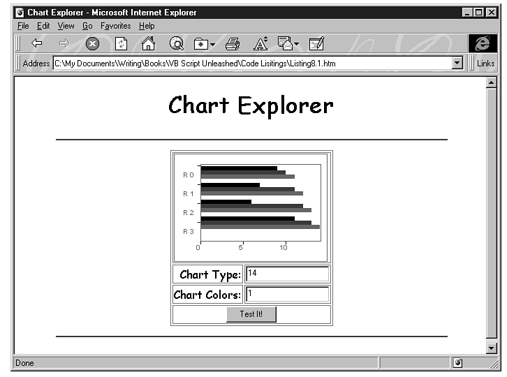
Listing 7.1 shows how you can use the Chart control in an HTML document. Entering numeric values in the text boxes changes the style of the chart in the page. (See Figure 7.1.)
Figure 7.1 : The Chart Wizard in Internet Explorer.
Listing 7.1. Using the Chart control in a reference document.
<HTML>

<HEAD>

<TITLE>Chart Explorer</TITLE>

</HEAD>

<BODY BGCOLOR=WHITE>

<CENTER>

<FONT FACE="Comic Sans MS">

<H1>Chart Explorer</H1>

<HR COLOR="BLUE" WIDTH=85%>

<TABLE BORDER BORDERCOLOR=RED>

<TR><TD COLSPAN=2>


<OBJECT ID="chart1" WIDTH=220 HEIGHT=155

 CLASSID="CLSID:FC25B780-75BE-11CF-8B01-444553540000">

    <PARAM NAME="_ExtentX" VALUE="5821">

    <PARAM NAME="_ExtentY" VALUE="4101">

    <PARAM NAME="Rows" VALUE="4">

    <PARAM NAME="Columns" VALUE="3">

    <PARAM NAME="ChartType" VALUE="0">

    <PARAM NAME="Data[0][0]" VALUE="9">

    <PARAM NAME="Data[0][1]" VALUE="10">

    <PARAM NAME="Data[0][2]" VALUE="11">

    <PARAM NAME="Data[1][0]" VALUE="7">

    <PARAM NAME="Data[1][1]" VALUE="11">

    <PARAM NAME="Data[1][2]" VALUE="12">

    <PARAM NAME="Data[2][0]" VALUE="6">

    <PARAM NAME="Data[2][1]" VALUE="12">

    <PARAM NAME="Data[2][2]" VALUE="13">

    <PARAM NAME="Data[3][0]" VALUE="11">

    <PARAM NAME="Data[3][1]" VALUE="13">

    <PARAM NAME="Data[3][2]" VALUE="14">

    <PARAM NAME="HorizontalAxis" VALUE="0">

    <PARAM NAME="VerticalAxis" VALUE="0">

    <PARAM NAME="hgridStyle" VALUE="0">

    <PARAM NAME="vgridStyle" VALUE="0">

    <PARAM NAME="ColorScheme" VALUE="0">

    <PARAM NAME="BackStyle" VALUE="1">

    <PARAM NAME="Scale" VALUE="100">

    <PARAM NAME="DisplayLegend" VALUE="1">

    <PARAM NAME="BackColor" VALUE="16777215">

    <PARAM NAME="ForeColor" VALUE="32768">

</OBJECT>


</TD>

</TR>


<TR>

    <TD ALIGN=RIGHT>Chart Type:</TD><TD><INPUT TYPE="TEXT" NAME="CT"></TD>

</TR>

<TR>

    <TD ALIGN=RIGHT>Chart Colors:</TD><TD><INPUT TYPE="TEXT" NAME="CC"></TD>

</TR>

<TR>

    <TD COLSPAN=2 ALIGN=CENTER>

    <INPUT TYPE="SUBMIT" NAME="BtnTest" VALUE="Test It!"></TD>

</TR>

</TABLE>

<HR COLOR="BLUE" WIDTH=85%>


<SCRIPT LANGUAGE="VBScript">

Sub BtnTest_OnClick

    If CT.Value = "" then CT.Value = "0"

    If CC.Value = "" then CC.Value = "0"

    chart1.ChartType=CT.Value

    chart1.ColorScheme=CC.Value

End Sub

</SCRIPT>


</BODY>

</HTML>
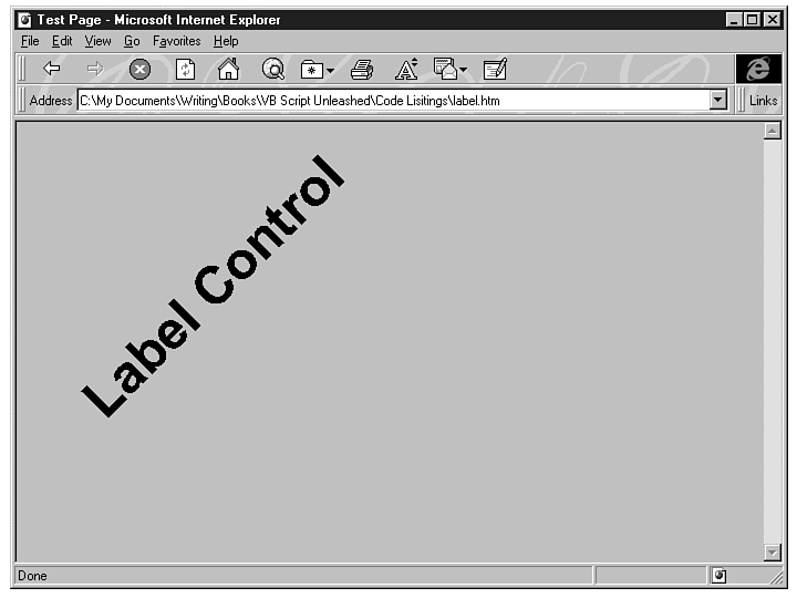
The Label control is a simple, elegant control that gives you quite a bit of flexibility when working with text. You can use the Label control to insert angled text into your HTML documents. (See Figure 7.2.) Using a Timer control or any other event, you can change the properties of the Label control at runtime. Table 7.6 lists the properties for the Label control.
Figure 7.2 : The Label control can do things that normal HTML cannot.
| Property | Description |
| Alignment | One of the following:
0=Left 1=Right 2=Centered 3=Top 4=Bottom |
| Angle | Angle at which text is displayed |
| BackStyle | One of the following: 0=Transparent 1=Opaque |
| Caption | Label text |
| FontBold | One of the following: 0=False 1=True |
| FontName | Name of the font |
| FontSize | Font size |
| FontStrikeout | One of the following: 0=False 1=True |
| FontUnderline | One of the following: 0=False 1=True |
| frcolor | Font forecolor (as an RGB hexadecimal triplet) |
The Label control has a Click event and has one method: About.
Listing 7.2 uses the Label control to enhance the look of a page.
Listing 7.2. Using the Label control.
<HTML>

<HEAD>

<TITLE>Tester Page</TITLE>

</HEAD>

<BODY BGCOLOR=WHITE>

<H1>Tester Page for VBScript</H1>

<HR COLOR="BLUE" WIDTH=85%>


<OBJECT ID="label1" WIDTH=75 HEIGHT=400 vspace=0

    align= ALT="<H1

 CLASSID="CLSID:99B42120-6EC7-11CF-A6C7-00AA00A47DD2">

    <PARAM NAME="_ExtentX" VALUE="1984">

    <PARAM NAME="_ExtentY" VALUE="10583">

    <PARAM NAME="Caption" VALUE="VBScript">

    <PARAM NAME="Angle" VALUE="90">

    <PARAM NAME="Alignment" VALUE="7">

    <PARAM NAME="Mode" VALUE="1">

    <PARAM NAME="FillStyle" VALUE="0">

    <PARAM NAME="FillStyle" VALUE="0">

    <PARAM NAME="ForeColor" VALUE="#000000">

    <PARAM NAME="BackColor" VALUE="#C0C0C0">

    <PARAM NAME="FontName" VALUE="Times New Roman">

    <PARAM NAME="FontSize" VALUE="36">

    <PARAM NAME="FontItalic" VALUE="0">

    <PARAM NAME="FontBold" VALUE="0">

    <PARAM NAME="FontUnderline" VALUE="0">

    <PARAM NAME="FontStrikeout" VALUE="0">

    <PARAM NAME="TopPoints" VALUE="0">

    <PARAM NAME="BotPoints" VALUE="0">

</OBJECT>


<OBJECT ID="label2" WIDTH=51 HEIGHT=400 vspace=0

    align= ALT="<H1

 CLASSID="CLSID:99B42120-6EC7-11CF-A6C7-00AA00A47DD2">

    <PARAM NAME="_ExtentX" VALUE="1349">

    <PARAM NAME="_ExtentY" VALUE="10583">

    <PARAM NAME="Caption" VALUE="UNLEASHED">

    <PARAM NAME="Angle" VALUE="90">

    <PARAM NAME="Alignment" VALUE="6">

    <PARAM NAME="Mode" VALUE="1">

    <PARAM NAME="FillStyle" VALUE="0">

    <PARAM NAME="FillStyle" VALUE="0">

    <PARAM NAME="ForeColor" VALUE="#000000">

    <PARAM NAME="BackColor" VALUE="#C0C0C0">

    <PARAM NAME="FontName" VALUE="Arial">

    <PARAM NAME="FontSize" VALUE="36">

    <PARAM NAME="FontItalic" VALUE="0">

    <PARAM NAME="FontBold" VALUE="1">

    <PARAM NAME="FontUnderline" VALUE="0">

    <PARAM NAME="FontStrikeout" VALUE="0">

    <PARAM NAME="TopPoints" VALUE="0">

    <PARAM NAME="BotPoints" VALUE="0">

</OBJECT>

</BODY>

</HTML>
You might have noticed that Listing 7.2 contains no VBScript code. I did this to show you that you can use some of these objects without writing any code at all. The really nice thing about the Label control is that you can create this vertical-text effect without making it a GIF or a JPG file. Saving bandwidth is always a good thing.
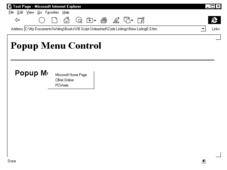
The Popup Menu control is used to create a popup menu when the user clicks a named control or image link with the mouse on a Web page. This control is used mostly for navigational purposes. If you have a lot of links on a Web page that contains other important data, you can place those links in a popup, giving your page a cleaner look.
The Popup Menu control has only one property, ItemCount. The ItemCount property is set to the number of items in the menu. The Menuitem[] parameter tag is used to label the individual items on the page. You can then use a script to call the URL of the page that you want to navigate to.
There are five methods associated with the Popup Menu control:
The one event for the Popup Menu control is Click(item). The index of the item clicked is passed to the event.
Listing 7.3 contains a script that uses the Popup Menu control. A Label control's click event is used to call Pop1.Popup. Notice that we use a Select Case block to retrieve the number of the item called.
Listing 7.3. Popup Menu control example.
<HTML>

<HEAD>

<TITLE>Test Page</TITLE>

</HEAD>

<BODY BGCOLOR=WHITE>

<H1>Popup Menu Control</H1>

<HR COLOR=NAVY>


<Table BORDER BGCOLOR=YELLOW></TR><TD>

<OBJECT ID="Label1" WIDTH=165 HEIGHT=44

 CLASSID="CLSID:99B42120-6EC7-11CF-A6C7-00AA00A47DD2">

    <PARAM NAME="_ExtentX" VALUE="4366">

    <PARAM NAME="_ExtentY" VALUE="1164">

    <PARAM NAME="Caption" VALUE="Popup Menu">

    <PARAM NAME="Angle" VALUE="0">

    <PARAM NAME="Alignment" VALUE="4">

    <PARAM NAME="Mode" VALUE="1">

    <PARAM NAME="FillStyle" VALUE="0">

    <PARAM NAME="FillStyle" VALUE="0">

    <PARAM NAME="ForeColor" VALUE="#000000">

    <PARAM NAME="BackColor" VALUE="#C0C0C0">

    <PARAM NAME="FontName" VALUE="Arial">

    <PARAM NAME="FontSize" VALUE="18">

    <PARAM NAME="FontItalic" VALUE="0">

    <PARAM NAME="FontBold" VALUE="1">

    <PARAM NAME="FontUnderline" VALUE="0">

    <PARAM NAME="FontStrikeout" VALUE="0">

    <PARAM NAME="TopPoints" VALUE="0">

    <PARAM NAME="BotPoints" VALUE="0">

</OBJECT>

</TR></TD></TABLE>

<OBJECT ID="Pop1" WIDTH=5 HEIGHT=5

 CLASSID="CLSID:7823A620-9DD9-11CF-A662-00AA00C066D2">

    <PARAM NAME="MenuItem[0]" VALUE="Microsoft Home Page">

    <PARAM NAME="MenuItem[1]" VALUE="C|Net Online">

    <PARAM NAME="MenuItem[2]" VALUE="PCWeek">

</OBJECT>


<Script Language=VBScript>


Sub Label1_Click

    call Pop1.PopUp()

End Sub


Sub Pop1_Click(byVal X)


Select Case X

    Case 1

        top.Location="http://www.microsoft.com"

    Case 2

        top.Location="http://www.cnet.com"

    Case 3

        top.Location="http://www.pcweek.com"

End Select


End Sub

</Script>

</BODY>

</HTML>
Figure 7.3 : Popup Menu control navigates to popular URLs.
The Menu control is very similar to the PopupMenu control. The Menu control is essentially a button control that pops up a menu for the user. This control has two properties, ItemCount and Caption. ItemCount refers to the number of items in the menu. The Caption property sets the caption of the button used to show the menu.
To add items to the menu, you use the Menuitem[] parameter. You can also set the caption for the control as a parameter.
The Menu control has the same methods and events as the Popup Menu control and can be programmed the same way.
You can use the Preloader control to anticipate the desires of your users and to download what, presumably, will be the next page they want to see. When they're ready to look at the page, it will pop up instantly and they will be amazed.
You need to be careful with this control. It won't do much good to preload a page unless that page is going to take a significant time to download, or any delay will cause the user to lose a feel for the flow of a number of pages.
The Preloader control has five properties:
The Preloader control has a single method, About, and two events:
The StockTicker control downloads information and displays it at preset intervals. The data files displayed can be in either text format or XRT format. To create a file to be used by the StockTicker control in text format, place the letters XRT on the first line and then specify the data as name-tab-value-CR/LF lines. For example:
XRT

Item1     Value1     Value2     Value3

Item2     Value1     Value2     Value3

Item3     Value1     Value2     Value3
The StockTicker control has the properties listed in Table 7.7.
| Property | Description |
| BackColor | Background color |
| DataObjectName | URL of the data file |
| DataObjectActive | 1=Active; 0=Inactive |
| ForeColor | Foreground color |
| OffsetValues | Vertical offset from name in pixels |
| ReloadInterval | Reload interval for the data file |
| ScrollWidth | Amount of scroll for each redraw |
| ScrollSpeed | Interval at which the display is scrolled |
The StockTicker control has only one method, AboutBox, and no events.
You can use the Timer to control time-based events in your code. The timer is especially useful if you need to track a repetitive event. If you don't have a timer to use in your pages, you have to use a loop in code, which bogs down your system.
The Timer control has two properties:
The Timer control supports only one event: Timer. The Timer event is triggered when the value of the Interval property has been passed.
The only method supported by the Timer control is About, which provides information about the control.
Listing 7.4 uses the Timer control to activate the controls on the page. Remember that you can't directly control the HTML content of a page without reloading. You can change the properties of active controls on a page, though, and those changes are reflected immediately. Listing 7.4 provides such an example.
Listing 7.4. Controlling objects with the timer.
<HTML>

<HEAD>

<TITLE>Changing Message Example</TITLE>

</HEAD>

<BODY BGCOLOR=WHITE>

<H1>Changing Message</H1>

<HR COLOR="YELLOW">

<TABLE BORDER BORDERCOLOR=GREEN>

<TR>

<TD>

    <OBJECT ID="label1" WIDTH=555 HEIGHT=40 align= vspace=0

 CLASSID="CLSID:99B42120-6EC7-11CF-A6C7-00AA00A47DD2">

    <PARAM NAME="_ExtentX" VALUE="14684">

    <PARAM NAME="_ExtentY" VALUE="1058">

    <PARAM NAME="Caption" VALUE="     Message Box">

    <PARAM NAME="Angle" VALUE="0">

    <PARAM NAME="Alignment" VALUE="4">

    <PARAM NAME="Mode" VALUE="1">

    <PARAM NAME="FillStyle" VALUE="0">

    <PARAM NAME="FillStyle" VALUE="0">

    <PARAM NAME="ForeColor" VALUE="#000000">

    <PARAM NAME="BackColor" VALUE="#C0C0C0">

    <PARAM NAME="FontName" VALUE="Arial">

    <PARAM NAME="FontSize" VALUE="14">

    <PARAM NAME="FontItalic" VALUE="0">

    <PARAM NAME="FontBold" VALUE="1">

    <PARAM NAME="FontUnderline" VALUE="0">

    <PARAM NAME="FontStrikeout" VALUE="0">

    <PARAM NAME="TopPoints" VALUE="0">

    <PARAM NAME="BotPoints" VALUE="0">

</OBJECT>

</TD>

</TR>

</TABLE>


    <OBJECT ID="Timer1" WIDTH=39 HEIGHT=39

     CLASSID="CLSID:59CCB4A0-727D-11CF-AC36-00AA00A47DD2">

        <PARAM NAME="_ExtentX" VALUE="1032">

        <PARAM NAME="_ExtentY" VALUE="1032">

        <PARAM NAME="Interval" VALUE="3000">

    </OBJECT>

<SCRIPT LANGUAGE="VBScript">

Dim x

x = 0

Sub timer1_timer

Dim Msg(3)

Msg(0)="     This is the first message.  Number 2 is coming up!"

Msg(1)="     The second message is finally here."

Msg(2)="     Message 3, time to go back to the first."

label1.caption = Msg(x)

x = x + 1

If x > 2 then x = 0

End Sub

    </SCRIPT>

</BODY>

</HTML>
Figure 7.4 : The message changes in the Timer example.
Listing 7.4 uses a timer and a Label control to display a series of messages. This is a nice effect, but with a little more code, you can make it more useful.
Suppose that you create a Web game and you want to give users a choice of places to which they can jump. You can use the index value of the message array to set up a URL for each message, as shown below:
Sub Label1_Click

timer1.enable = 0

If x=0 then MyUrl = "http://www.thespot.com"

If x=1 then MyUrl = "http://www.yahoo.com"

If x=2 then MyUrl = "http://www.cnet.com"

Self.Location.href=MyUrl

End Sub
In this subroutine, you use the Click event for the Label control to interrupt the timer. Because x was declared as a global variable, its value is available to all the procedures in the script. In this case, the value of x is used to determine the value of MyUrl, which is then loaded in the browser.
Using controls that you purchase in your pages isn't much different than using controls that are freely available. You must make the control available to your user as an ActiveX control that loads itself, or you need to make sure that the control is registered on your user's machine. You also must adhere to the licensing requirements for the control. Check with the vendor for the details about using their controls in your Web pages.
Because ActiveX controls are potentially such powerful components, you must consider some security issues. Remember that an ActiveX control can do anything that can be done on a client machine. You want users to take advantage of the ActiveX controls that you've linked into your document, so the question is, "How can my reader be sure that the control is safe?"
If you make sure that the controls you use are signed, you'll stand a much better chance of having casual browsers see what you've added to your page. Code signing lets the user know who produced the code and whether that code has been changed since the control was signed. Users can set the level of security for the controls that are loaded into their browsers. They can accept all controls from a particular company, accept controls after a confirmation dialog, and accept or reject all controls to be loaded on to their machines. If the controls you're using are not signed, Internet Explorer notifies those users who are concerned about network security or simply rejects the control outright.
One of the great things about using OCXs in your Internet documents is that OLE controls themselves are written in a language that's familiar to many programmers: C++.
If you're a C++ programmer, you're probably already familiar with creating OLE custom controls. If you're not a C++ programmer, but you think you might like to become one in order to create OLE controls, this quick look at OCX development might interest you. Here, you'll look at creating the default custom control with Microsoft Visual C++ 4.0.
Programming in C++ is not very much like programming in Visual Basic or VBScript. C++ is a programming language developed by Bjarne Stroustrup in the early 1980s. It's a version of the C language that contains extensive object-oriented features.
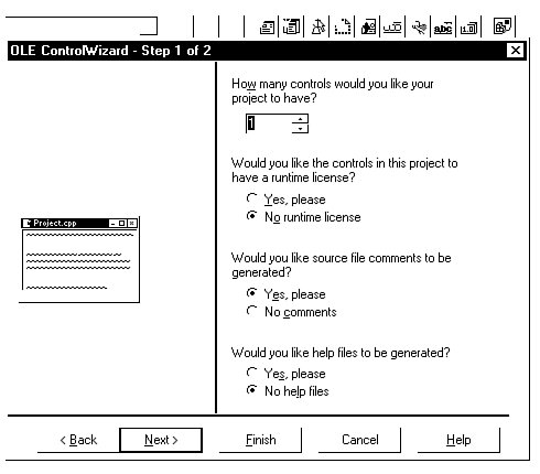
Because C++ is a language based on reusable and extensible code, Microsoft has encapsulated the Win32 API, along with many other features, into the Microsoft Foundation Classes (MFC). The MFC is the C++ wrapper around the Win32 API and the basis for development in the VC++ IDE (Integrated Development Environment) using a feature called the OLE Control Wizard. (See Figure 7.5.)
Figure 7.5 : The OLE Control Wizard automates the process of creating ActiveX controls.
The Control Wizard is the part of Developer Studio that generates the files needed to create an MFC-based ActiveX control. To create the basic files for an OCX control, follow these steps:
The Control Wizard now spends some time generating the skeleton files you'll need for your new control.
To build a control, choose Build from the Build menu. Again, this isn't Visual Basic or VBScript, so you'll have to wait a few seconds while your new control is compiled and linked. When it's all over, you'll have a nice CIRCLE.OCX file that you can register with your system.
Registering your control from Developer Studio is easy. Simply choose Tools | Register Control and it's done. Now you can test the new control.
You can test your new control with the OLE control test container, which you start from the Tools menu in Developer Studio. After the container opens, choose Edit | Insert OLE Control to add the CIRCLE.OCX file to the container. You can manipulate the file within the test area.
If you're thinking about getting into custom control development with C++ and MFC, you should keep some things in mind:
This simple control is the default created by the Control Wizard. To get a control to do even a little more takes a bit of work.
Though the size of the ActiveX controls created with the Control Wizard is modest, for users to access this control in their own browsers, they need to have installed the MFC runtime library, which is quite large. In addition, because ActiveX controls are designed to eventually run on Windows, Macintosh, and UNIX computers, Microsoft wrote a non-MFC specification so that ActiveX controls could be made smaller and more portable. Check the ActiveX Software Development Kit for details.
To have the controls that you create certified for Internet use, you'll have to visit an ActiveX control Certificate Authority and carefully read through the procedures for having your controls certified. Once you've received credentials from such an authority, you'll need to prepare your code for signing. Details and tools for doing this are included with the ActiveX Development Kit. As of this writing, details regarding obtaining credentials could be found at http://www.microsoft.com/intdev/sdk/docs/com/comintro-f.htm.
In this chapter, you learned about ActiveX controls and how you can use them to enhance your Web pages. You saw that ActiveX controls are extremely powerful, and that verification should be considered when using them. You then examined the controls that are freely available to Web designers and VBScript programmers. Finally, you took a quick look at part of the Microsoft Developer Studio called the Control Wizard, which helps C++ programmers create their own custom controls.