


Other chapters have described simple animations for fun, animations to demonstrate a concept, navigation tools, Internet Lingo, advanced Lingo concepts, alternatives to Shockwave, and many other topics.
This chapter takes you through the complete steps of creating a Shocked Web site. It won't describe every step in detail, just enough information to illuminate the process and review some important concepts. You should be able to follow the steps and easily adapt some of the basic ideas to your own site. To look at the example, load the HTML file, shocked.html from the chapter 15 directory on the CD-ROM. All of the pieces that go along with this HTML document are in the directory called site1 within the chapter 15 directory.
What this chapter covers:
This chapter starts by going through a few example Shockwave sites that are currently out on the Web. You might continually check a variety of sites to get ideas and to see what other developers are creating.
And what better place to start than Macromedia's Web site (http://www.macromedia.com). As the creator of Shockwave, it usually has various Shockwave movies on its site as well as links to other notable Shockwave Web sites.
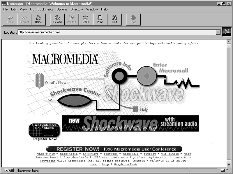
Figure 15.1 shows Macromedia's opening Web page, which contains a Shockwave movie. It is basically a navigation tool with rollovers for the various areas of the Web site. An animation continually runs while waiting for the user to interact. Notice that Macromedia displays small text links at the bottom of the page to allow the user to quickly locate an area without waiting for the Shockwave movie (or for users who don't have the Shockwave plug-in or a supporting browser).
Figure 15.1 : Macromedia's beginning Web page.
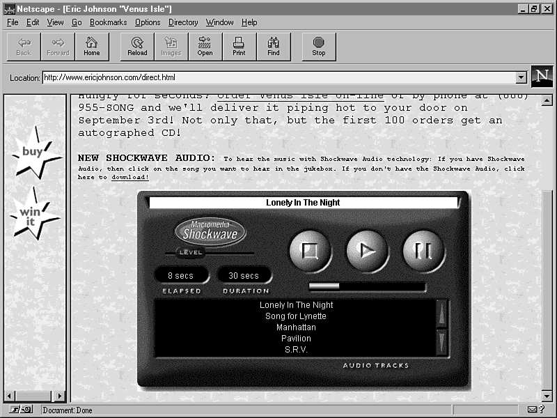
Figure 15.2 is a Shockwave Web site that uses audio streaming. It is promoting the music of Eric Johnson and allows the user to select a song from his latest CD and listen to it. The Shockwave movie is a sort of "digital stereo" somewhat similar to the one you will find in Chapter 18, "Shockwave for Audio." The digital stereo idea is fast becoming a cliché on Shockwave Web sites, but there is nothing wrong with using it. This Web site uses two frames: one on the left with two navigation buttons and one on the right with the Shockwave movie and some text with other links.
Figure 15.2 : A Shockwave for Audio Web site.
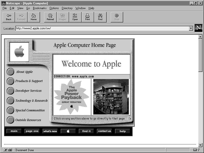
Apple Computers use a Quicktime VR effect in their Shockwave home page (figure 15.3). Quicktime VR was developed by Apple as a type of virtual reality interface. The user clicks left and right on an image and it seems to scroll three-dimensionally. The image here is very small, because a larger image would require a longer download time. This Shockwave movie also has buttons on one side to navigate through the Web site.
Figure 15.3 : Apple's home page.
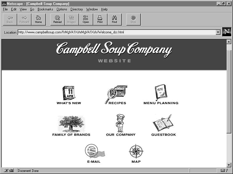
Campbell's Soup has a few simple animations in the form of Shockwave movies on its Web site (figure 15.4). The images are static until the user rolls the mouse over them, resulting in some elementary motion. Not extremely thrilling in comparison to some other Shockwave Web sites, but still an added dimension to what could be a fairly plain site.
Figure 15.4 : Campbell Soup uses Shockwave as a navigation tool.
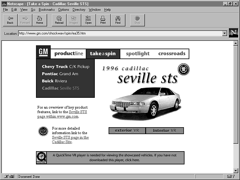
Figure 15.5 shows GM's Shockwave Web site. Using highlighted rollovers, the user knows that the top text items are clickable links. Other Shockwave movies are found throughout the site with animation and sound, while the link rollovers are always available. The Shockwave movies are fairly conservative with more emphasis placed on information and ease of navigation.
Figure 15.5 : GM's Shockwave site.
Storyboards were originally (and still are) used to visualize
important scenes in a film, television show, play, and so on.
Rough sketches depict key events and basic ideas of the plot.
Adopted by the business world, the word "storyboard"
can now mean just about any plan for a finished product.
| Back to the Old Drawing Board |
Good ideas are more valuable than all the RAM chips in the world. Creation of your Web site begins the moment you visualize it in your head. A graphic designer once told me that he wouldn't sit at the computer until he had his ideas worked out on paper. I don't know if I completely agree, because the computer can be an excellent tool to spark ideas, but it is true that you need a plan before you can begin. |
To create a Web site, you need to plan the structure and key elements
of the site ahead of time. Don't be afraid to get a big pad of
paper and a sharp number two pencil and sketch ideas. You may
find that your first idea often sounds good, but if you continue
to think about more ideas, you come up with something even better
than your original concept.
| Note |
Creating a good Web site takes much hard work, planning, and time. Companies pay thousands of dollars to have their sites created. The sample here is really only the beginning-an example to help you understand the process. By no means is this the "best" Shockwave site, it is merely a tool to demonstrate, help you learn, and give you some ideas of your own. |
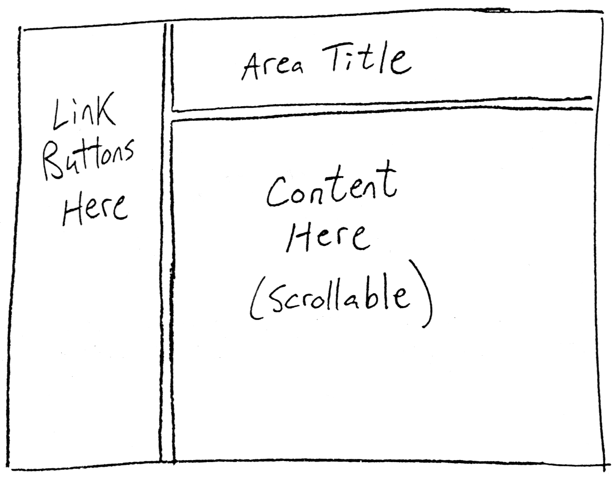
For this example Web site, it was decided to divide the page into three frames-one on the left with the navigation buttons (home, links, e-mail, and so on), one on the top right with the area title, and a large one below that with the main Web pages containing the actual site content. By using three frames, the user always has access to the links in the left frame and always can see the title of the Web page he or she is viewing. The content in the bottom frame can be scrolled without losing the links and the title. It's easy to go crazy with frames and divide the screen into a maze of boxes, but too many can quickly lead to an impractical Web site. A few well thought out frames can function quite well. Keep in mind that not all users will be capable of viewing frames, so you might decide to have an alternative Web site plan. Figure 15.6 shows the basic layout of this idea.
Figure 15.6 : The basic layout of our sample Web site.
You will have two Shockwave movies always going at once. One is the navigation movie in the left frame. It will have simple rollover buttons to let the user know that they are clickable. When clicked, each button targets the other two frames to change what is displayed. The other Shockwave movie goes in the top frame and displays the title of the current Web area the user is viewing.
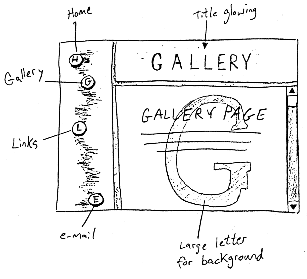
After sketching out a plan for the site (figure 15.7), you're ready to begin construction.
Figure 15.7 : A conceptual sketch of the Web site.
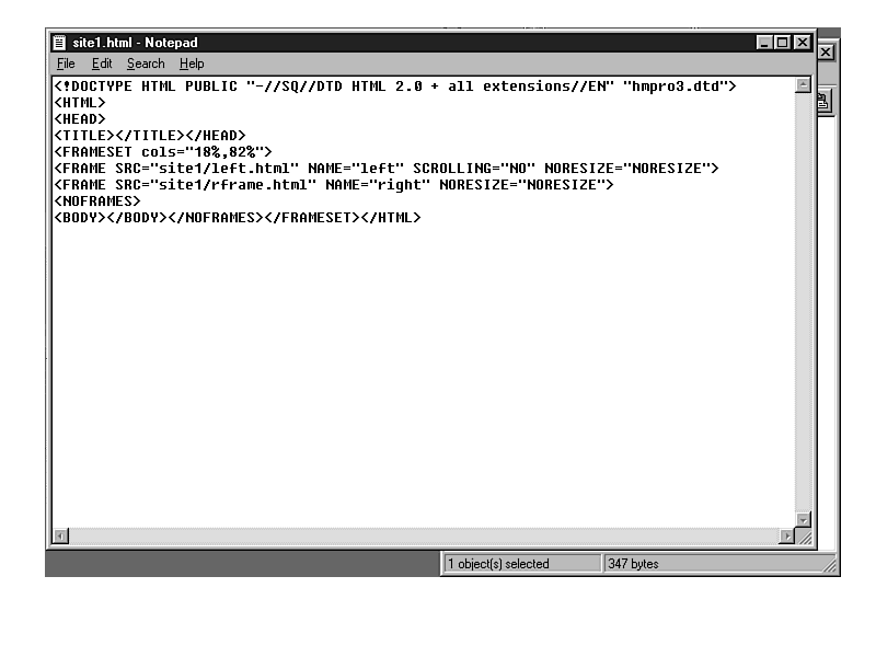
You need to create two starting HTML documents to set up your screen for the frames. The first HTML page divides the screen into a left and right frame. After a little experimenting, I decided to use 18 percent of the screen for the left frame and 82 percent for the right frame. I named the frames "left" and "right" and put an HTML document in each. In the left frame, I put left.html and in the right frame I put rframe.html. My starting HTML file, called shocked.html can be seen in figure 15.8.
Figure 15.8 : The first HTML file that divides the screen into two frames.
The HTML statements important here are the three that define the frames:
<FRAMESET cols="18%,82%">
<FRAME SRC="site1/left.html" NAME="left" SCROLLING="NO"
 NORESIZE="NORESIZE">
<FRAME SRC="site1/rframe.html" NAME="right" NORESIZE="NORESIZE">
The first statement above separates the screen into columns, which makes a vertical frame division. Using percentages instead of pixels allows the same statement to work appropriately on any monitor, independent of the video resolution. The second two statements place two other HTML documents into the two frames. They also define the frame names and set a few parameters. I decided that the left frame would not be scrollable because it will only contain the Shockwave movie with Web site links. The NORESIZE parameter prevents the viewer from adjusting the frame positions.
Now, to divide the right frame into two more frames (for a total of three) I created the rframe.html document (figure 15.9) using 20 percent and 80 percent for the positions. The top frame is named "top" and the bottom frame is named "bottom." This right frame area will be changing, but I started out using the two HTML documents that go with the home page. Notice that neither shocked.html nor rframe.html contains any actual Web page content; they are used only to set up the site into the three frames.
Figure 15.9 : The second HTML document divides the right frame into two more frames.
I planned ahead to name everything that goes in the top something-glow.html because the titles glow. And everything in the bottom frame is called something-main.html because that is the frame for the main content. So, the two HTML files for the home page are homeglow.html and homemain.html. These are empty HTML documents for now, but you have the basic structure set up and you're ready to create and assemble the pieces.
Each area of the Web site will have a different Shockwave movie displaying the title. These will be put into the top frame. You need to create four separate movies: Home, Gallery, Links, and E-mail.
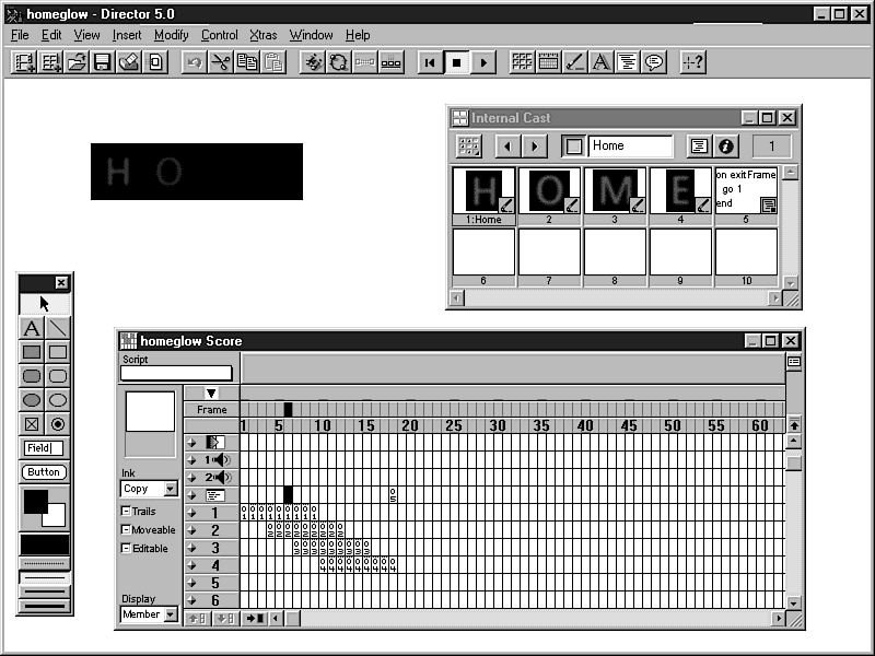
The movies are quite simple. The blurred letters were created in Photoshop by placing text on a black background then using a blur filter. Each letter was separated as an individual cast member and placed on a black background in Director. By "in-betweening" their sprite blend values, you make each letter fade in and out to give the appearance that the letters glow one by one. Figure 15.10 shows one of the glowing movies in Director.
Figure 15.10: Using sprite blends to make the letters glow.
These movies are named the same as the HTML document that will contain them: homeglow.dir, gallglow.dir, linkglow.dir, and mailglow.dir. Naming the movies this way helps you to remember what movie goes on what page. With only four pages of movies it isn't too bad, but it can easily get confusing to have to remember a lot of file names.
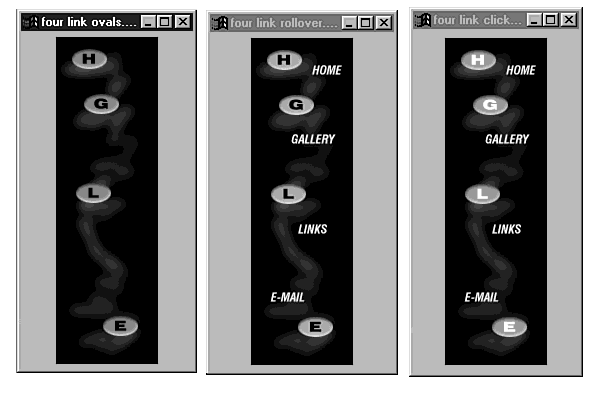
Those four movies all are very small (under 5K) so that the user doesn't have a long download time when switching between sections. The other movie is a bit larger (27K), but only needs to load once, then stays in the left frame. It contains four buttons that navigate through the Web site. I created a background graphic, rollover, and click states for each of the buttons. The three states of the graphics are shown in figure 15.11.
Figure 15.11: The graphics used in the navigation movie before being split apart as cast members.
The first graphic was imported into Director and placed on a black background. The rollover and click state images were also imported but were broken into individual cast members for each of the buttons. The rollover and click state cast members were placed in the score over the top of the background image in eight sprite channels (four for the rollover images, and four for the click images). The eight sprites were turned invisible using a Lingo script:
on exitFrame
  repeat with x=2 to 9
    set the visible of sprite x to false
  end repeat
end
You learned in other chapters how to work with rollovers and mouse clicks.A looping frame script controls the rollovers of the four sprites by setting them visible or invisible depending on the mouse location. For each of the four buttons, there are two Lingo statements that need to execute to load new HTML documents in the top and bottom frames on the right side of the screen. The script for the "links" button, for example, looks like this:
on mousedown
  set the visible of sprite 8 to true
  puppetsound "robot"
  updatestage
end

on mouseup
  set the visible of sprite 8 to false
  updatestage
  gotonetpage "linkmain.html," "bottom"
  gotonetpage "linkglow.html," "top"
end
The statements that set the sprite visible or invisible are what control the appearance of the button when it's clicked (it turns orange). A puppetsound command plays a sound effect when the button is pressed. The two statements in the mouseup handler are what control the changing of the other frames. Using the gotonetpage command, new HTML documents are targeted to the other frames, called "bottom" and "top." See chapters 13 and 14, "Internet Lingo for Shockwave" and "Further Use of Internet Lingo," respectively, for more on using network Lingo.
The other three buttons are set up the same way-loading appropriate
HTML documents to the two frames.
| Note |
It would have been nice to have the "e-mail" button bring up the mail window of the browser. I tried using this Lingo command: gotonetpage "mailto:pdg@ix.netcom.com" The mail window did come up, but the gotonetpage command inserts a slash into the address line so it reads, "/pdg@ix.netcom.com," which would not mail properly. Getnettext seemed to do the same thing. Perhaps future versions of Shockwave will change this. If you find a way around it let me know! Our work around here is to load a whole new HTML page in the bottom window with e-mail links. At least there is a benefit to that because more than one address can be made available. |
The navigation movie, called nav.dcr is embedded into the left.html document. It is put onto a black background so the bounding rectangle isn't visible.
<html>
<body bgcolor=000000>
<center>
<embed src="nav.dcr" height=400 width=96>
</center>
</body>
</html>
The other four movies are embedded into their respective HTML documents. For an example, here is the gallery movie embedded. It looks very similar to the other embed statement.
<html>
<body bgcolor=000000>
<center>
<embed src="gallglow.dir" height=50 width=224>
</center>
</body>
</html>
Our main Shockwave movies are now complete. Others may be used in the content area (the "bottom frame") but for this example we are finished. Now we can work on the HTML documents for the bottom frame.
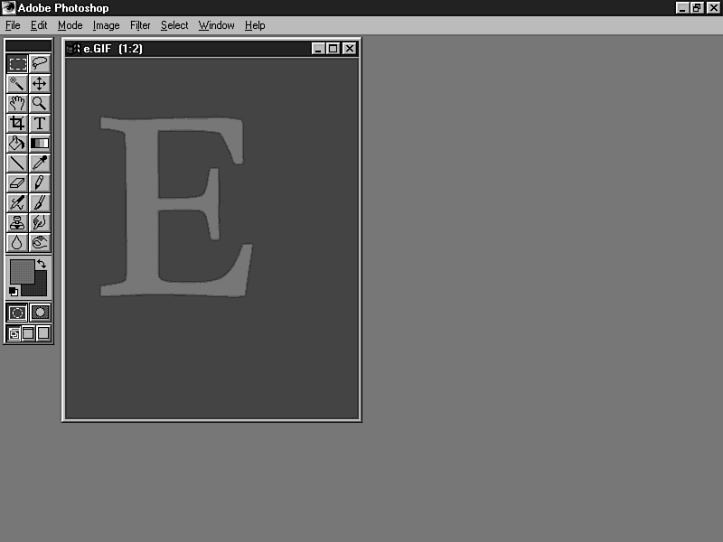
The plan is to have large letters as the background image for the content areas. By using big areas of flat color and saving the images as 3-bit GIFs, the file size is very small even though the images are huge in physical dimensions (figure 15.12). Remember that the GIF format compresses images just like Afterburner compresses Director movies. Each of the letters ended up being only about 5K.
In the HTML document for each page, I couldn't just use a normal <img src= "filename"> tag because my text could not flow over the top of it. Using the <body background= "filename"> tag makes a tiled background, but I only wanted one big letter. So I created the image with a large area of blank space around the letter so the next tile wouldn't be visible. Depending on how much text and other items are placed over the background, it would have tiled eventually, but the example doesn't go very far down the page. If there were more items, you would either have to live with the tile or make the background image have even more blank space below the letter.
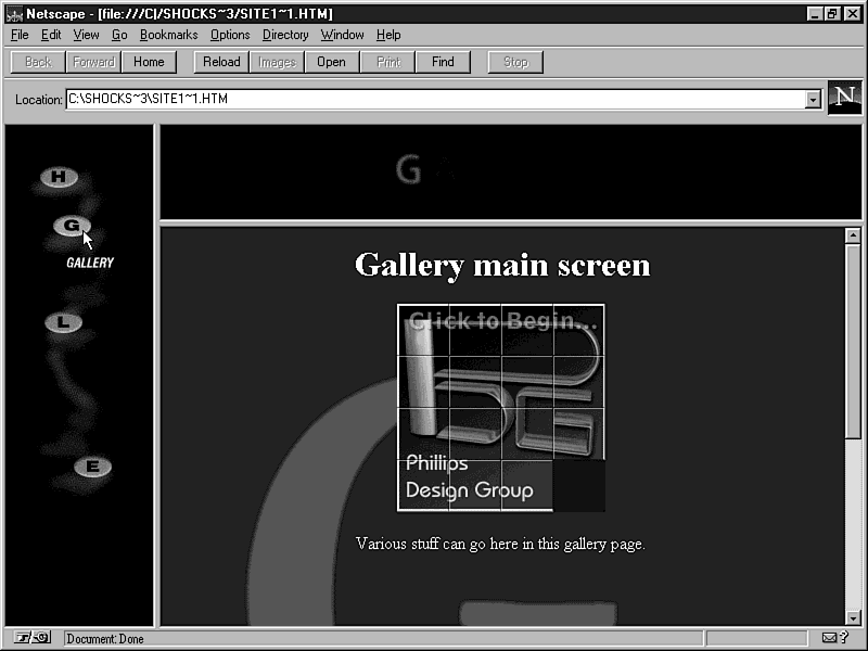
The content is pretty bare bones in this example. There are just a few sentences on each page to describe the area and give you an idea of what could be put there. It wouldn't help your purposes to fill the pages with information, anyway. Figure 15.13 is called "The finished Web site" but it's really just a basic framework-you can see how more depth can be added.
Figure 15.13: The finished Web site.
Note that the "gallery" section contains another Shockwave movie. It's a small slider game where the player has to rearrange the squares into the proper positions; you'll find this movie in the gallery at the end of this book. Having this Shockwave movie on the page means that there are three running at one time. It seems to work fine on my computer, but someone with a slower machine might have more trouble. Macromedia doesn't recommend running more than a few at a time. Feel free to push the limits, but be aware that some viewers might not appreciate it.
This example will only be visible to viewers with a frames-capable browser and the Shockwave plug-in. Though Netscape Navigator and Microsoft's Internet Explorer are the most popular browsers and support these features, there are many browsers that do not. For people using those browsers, you may decide to have a starting Web page that gives the option of enhanced or nonenhanced. The enhanced version loads your Shockwave site, while the nonenhanced uses only basic HTML pages.
If you don't want to give the option to the user, you might choose to have a tiny movie on a basic Web page that contains a GoToNetPage command to load the Shockwave page. If the browser doesn't support Shockwave, nothing happens and they stay on the basic page with normal links. If the user does have Shockwave, the enhanced site will automatically load via the GoToNetPage command. See chapter 13, "Internet Lingo for Shockwave"for more on this idea.
You have learned about all of the pieces of a Shockwave Web site and you have seen them put together. By this point, you should have a very good idea of how a Shocked site can be designed. But the real fun begins when you come up with your own ideas and your own creations. Hopefully, this book gives you a starting point and the fundamentals you need to Shock your Web presence: