 |
An IntraBuilder scheme is a collection of font, color, and bitmap settings that you can apply as a set. They save you the trouble of having to set item attributes individually and help your apps adhere to a specific motif. |
by Ken Henderson
Today you'll learn two distinct methods for creating new forms. First, you'll create a simple form using the IntraBuilder Form Expert, and then you'll create one from scratch using IntraBuilder's Form Designer.
Going down both paths should give you a nice initiation into the mechanics of IntraBuilder form design. The method you choose when developing real applications will depend largely on the type of form you're building at any given time. Issues, such as the complexity of the form and whether it's database-related, will affect whether you use the Form Expert or build the form from the ground up. You even might use a combination of the two approaches. Keep in mind that forms built using the Form Expert can still be customized in the Form Designer.
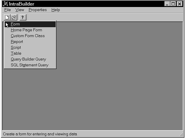
Let's begin by creating a form using the IntraBuilder Form Expert. Click the New button on the IntraBuilder toolbar, and then select Form from the pop-up menu, as illustrated by Figure 3.1.
Figure 3.1 : Click the New toolbar button to start a new form.
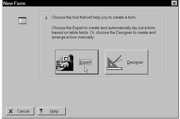
After you've selected Form, a dialog box appears asking you to choose whether to create the new form using the Form Expert or the Form Designer, as shown in Figure 3.2. Click the Form Expert button.
Figure 3.2 : You can create forms using the Form Expert.
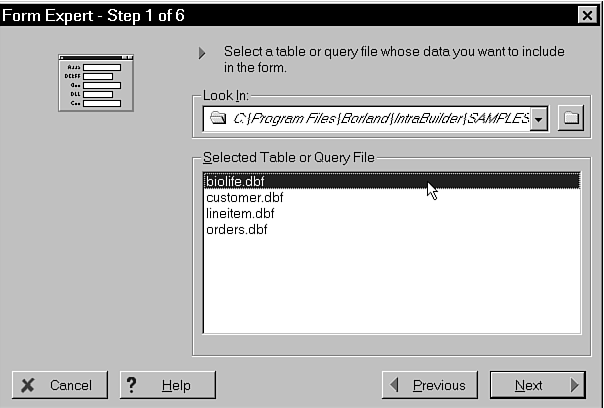
There are six steps involved in creating a form using the IntraBuilder Form Expert. The first one is to select a table or query on which to base the form.
After you've clicked the Form Expert button, you'll be presented with a dialog box in which you can specify your new form's base table or query. By default, Paradox and dBASE tables are listed, along with any query files (those having .SQL or .QRY extensions) presently in the Look In directory. Click the folder icon to the right of the Look In drop-down list box and select the Samples subdirectory under your IntraBuilder base directory (which will probably be C:\Program Files\Borland\IntraBuilder\SAMPLES).
You should then see a list of tables and queries located in this directory. Select the biolife.dbf table and then click Next. Figure 3.3 shows the Look In list box.
Figure 3.3 : Select the BIOLIFE table as the basis of your new form.
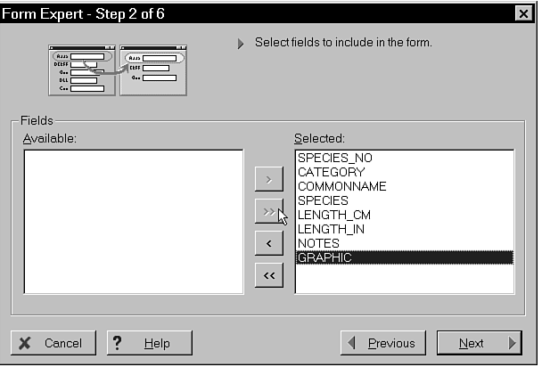
After you've selected your base table, the next step is to select which of its columns you'd like included in the new form. A dialog box like the one shown in Figure 3.4 is displayed, and you can choose which of the table's fields you want on the form. You can click the single right-arrow (>) to add individual fields, or you can click the double right-arrow (>>) to add all the fields to the form. Click the doubleright-arrow now to add all of BIOLIFE's columns to your new form, and then click Next.
Figure 3.4 : The Step 2 dialog as it appears when all fields have been selected.
After you've selected which columns to include, you're then asked to select a basic layout for the new form, as shown in Figure 3.5. You've got two choices: Columnar and Form Layout. Selecting Columnar Layout vertically aligns the table columns on the form. Selecting Form Layout places them next to each other in a multiple-row, horizontal format. Click Next to accept the default Columnar Layout for your new form.
Figure 3.5 : Select the way you'd like your new form laid out.
Now that the database underpinnings of the new form are in place, you're ready to specify some of its more visual aspects. You specify display attributes for the various items on the form in the fourth step of the six-step Form Expert process.
IntraBuilder groups font and color attributes into sets called
"schemes." These are not unlike the color and font schemes
available in Windows itself. IntraBuilder includes a number of
ready-to-use schemes that you can make use of either directly
or as the basis for new schemes of your own.
|
An IntraBuilder scheme is a collection of font, color, and bitmap settings that you can apply as a set. They save you the trouble of having to set item attributes individually and help your apps adhere to a specific motif. |
Each element of a form's basic appearance can be customized from the Step 4 dialog box. You can control the color and font of a form's title and labels. You can also specify a form's background bitmap and its base color. As you modify a form's display settings, the Sample area in the upper-left corner of the dialog box changes to reflect your selections.
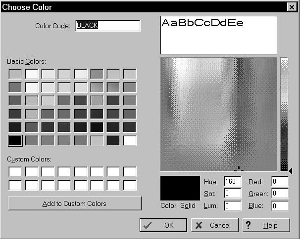
To adjust the color of a particular display element, either select a new color from the element's Color drop-down list or click the adjust button (the wrench) to the right of the list. Figure 3.6 illustrates the Choose Color dialog box that appears.
Figure 3.6 : Adjust colors using the palette in the Choose Color dialog box.
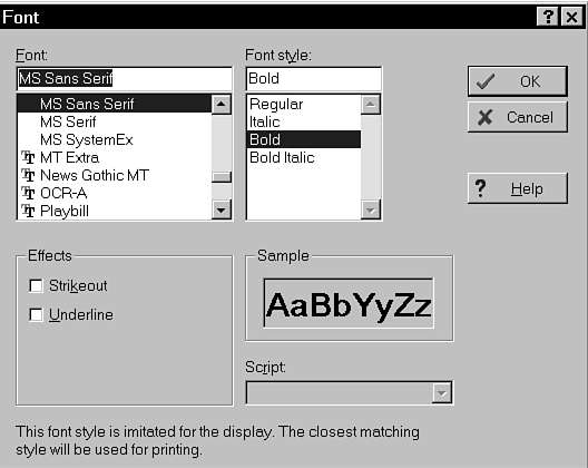
If you want to change the font specification for the title or labels placed on the form by the Form Expert, click either the Title or the Labels tab, and then click the adjust button (the wrench) to the right of the Font box. Figure 3.7 illustrates the Font dialog box.
Figure 3.7 : Use the Font dialog box to change the display font.
You can set the form's background color and bitmap by clicking the dialog box's Form tab and then clicking either the Color or Background Image drop-down lists.
After you've finished customizing the new form to your satisfaction, you can save the selections you made as a custom scheme. If you click the Save As Scheme button, you'll be asked to name your new scheme for insertion into the IntraBuilder scheme list. Figure 3.8 shows the Scheme Name dialog box.
Figure 3.8 : You can add custom color and font schemes to those included with IntraBuilder.
For now, select one of the built-in schemes and click Next to continue. Figure 3.9 shows how IntraBuilder displays the chosen scheme in a window.
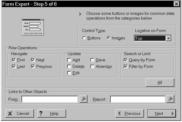
The fifth step in the Form Expert process consists of configuring the types of database operations that the new form is expected to support. These are referred to as "Row Operations" by the dialog box. There are three basic types of row operations:
Navigation consists of moving backward and forward through the rows in a datasource. For example, you can include buttons that enable users to move to a table's first row, its previous row, its next row, and its last row.
Update operations consist of making changes to data in a table's or query's rows. You can include buttons that permit rows to be added, edited, or deleted. You also can include Save and Abandon buttons to allow the user to specify whether to save data changes permanently or to discard them.
Search or limit operations facilitate either locating a given row using a query expression or restricting the row view to a subset matching a set of criteria. Selecting the Query by Form option causes a New Query button to be added to the form. This enables the user to locate a given record by specifying search criteria on the form. Selecting the Filter by Form option includes a New Filter button on the form. This permits the user to restrict the rows displayed to just those matching a set of criteria. These criteria are specified by the user using the form itself.
Let's say, for example, that a user wants to find rows containing the species Ginglymostoma cirratum. She can click the form's New Query button, type Ginglymostoma cirratum into the SPECIES field, and then click the Run Query button. The form will then display the next row containing the species she specified. Likewise, if she wants to limit the rows visible on the form to just those of the category "Shark," she can click the New Filter button and key Shark into the CATEGORY field, and then click the Run Filter button. This will restrict the rows displayed to just those whose CATEGORY column contains "Shark".
Click the All button in the Row Operations panel to include all possible buttons on the form. If you select Buttons in the Control Type radio button group, you'll get buttons with text labels on your new form. If you select Images, you'll get buttons with graphic labels instead. The Location on Form drop-down list determines where the buttons actually appear on the form.
The lower portion of the Step 5 dialog box includes entry fields for specifying other objects that you want to link to the new form. The Form Expert creates links to the objects you specify when it creates your new form. If you opt to create button controls on the form (in the Control Type radio button group), you'll get buttons labeled Run Form or Run Report. If you select image controls, you'll get an icon for each linked object instead.
Figure 3.10 shows the completed dialog box from Step 5. Click Next to proceed to the final Form Expert dialog box.
Figure 3.10 : In Step 5 of the Form Expert, specify which buttons to include.
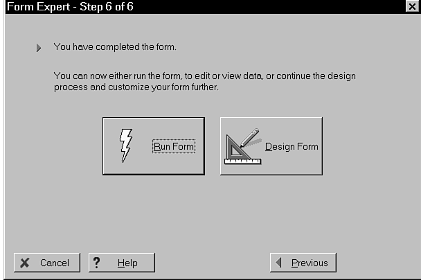
Now that you've given the Form Expert all the information it needs to create your new form, you can either run the new form or open it in the IntraBuilder Form Designer. Click the Run Form button (as illustrated in Figure 3.11) to run your new form.
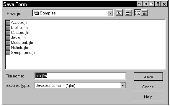
When you elect to run a newly created form, IntraBuilder requires that you save the form to disk first. Key in a name for your new form and click Save, as Figure 3.12 shows.
Figure 3.12 : IntraBuilder requires you to save new forms before running them.
| NOTE |
The forms you create in IntraBuilder have the extension .JFM by default. This stands for JavaScript Form (in case you've forgotten, JavaScript is IntraBuilder's native language). Likewise, reports use the .JRP extension by default. This stands for JavaScript Report. |
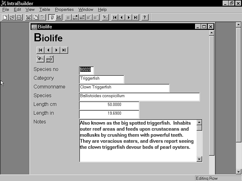
After you've saved the file to disk, IntraBuilder runs it. Figure 3.13 shows what your new form might look like at runtime. Note that I've maximized it here so that all its buttons are visible.
Figure 3.13 : Your new form as it might appear when run.
As mentioned previously, the second major task you'll undertake today is the building of a new form from scratch. To do this, you'll work in IntraBuilder's Form Designer instead of its Form Expert. Before you start, make sure you are in the Samples folder. Begin by clicking New on the IntraBuilder toolbar and then selecting Form from the pop-up menu. When the dialog box appears asking whether to start the Form Expert or Designer, click the Designer button. Figure 3.14 shows what your new form should look like.
Figure 3.14 : A new form as it initially appears in the Form Designer.
As when building a form via the Form Expert, the first order of business is to choose a datasource on which to base your new form. You'll set this up using the IntraBuilder Query component, regardless of whether you wish to base your form on an entire table or use a custom SQL query.
Click the Query component now on the Component Palette (it should be the third component from the right of the palette if the toolbar is docked at the top of the screen) and then click your form to drop the component onto it. The actual location of the Query component on the form is unimportant because it will not display at runtime.
After you've done this, either press f11 or right-click the Query component and select Inspector from the content menu to bring up the IntraBuilder Inspector. You use the Inspector to set an object's individual attributes. In this case, you'll need to set only two properties of the Query component. First, click the Query's sql property and set it to select * from "BIOLIFE.DBF". This causes all the columns in the Biolife table to be returned when the query is executed. Next, click the Query component's active property and set it to true. This actually executes the query and causes its result set to be available to your form. Figure 3.15 shows what the form should look like thus far.
Figure 3.15 : Your new form as it appears with the Query component in place.
Now that your Query component is in place, click the Save button
on the IntraBuilder toolbar to save your work before going further.
Name the new form bio2.
| TIP |
An easier way to add queries to a form is to drag them from the IntraBuilder Explorer and drop them on the Form Designer. When you drop a table on a form, IntraBuilder sets the sql and active properties for you. The drag-and-drop approach also creates more intuitive query names such as biolife1, instead of query1. The first table you drop on a form is set to the form's rowset. |
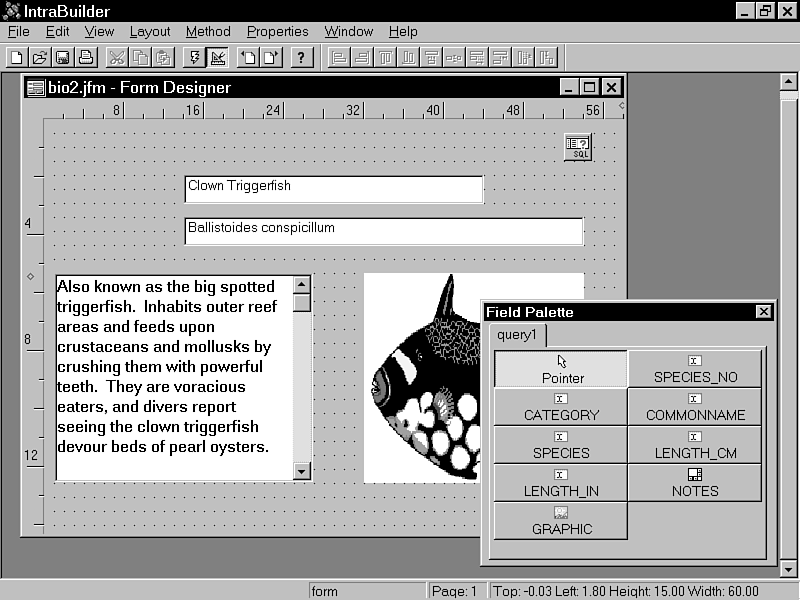
The next step you'll take is to drop the fields returned by your Query component onto your new form. If the Field Palette isn't visible already, click the View|Field Palette option to make the palette visible. After the Field Palette is on-screen, drag each of the fields it lists onto the form, positioning them toward the horizontal center of the form, each one below its predecessor. Align the fields along their left edges and size the NOTES and GRAPHIC fields so that they look sensible. Note that you may need to widen your form to achieve the desired effect. Notice that each field already displays data. This is because you set the Query component's active property to TRUE earlier. Because the Query is active (open), its result set is available and displayed by the IntraBuilder Designer.
After you've added some fields, close the Field Palette. Figure 3.16 shows what the form should look like after adding some fields.
Figure 3.16 : Your new form with its fields in place.
| NOTE |
The IntraBuilder Designer automatically sizes fields you drag from the Field Palette onto a form or report. Sizes are based on the field's length in its host table. This saves you the trouble of having to size controls individually and ensures that there is sufficient editing room in each field. |
Now that the fields are in place, the next step is to set up field labels. In IntraBuilder, you set up labels and other types of static form text using the HTML control. Locate the HTML component in the IntraBuilder Component Palette and drop one to the left of each of your field components. Bring up the Inspector for each HTML control and set its text property to the name of the field to its right. Don't worry about specifying fonts or colors right now-you'll do that later. Figure 3.17 illustrates what you should see thus far.
Figure 3.17 : Setting up field labels using the HTML component.
| NOTE |
A great way to know which labels go with which field components is to open the field components' host Query from the Designer. (You did this earlier by setting its active property to true.) This will cause data from the underlying database to be displayed in your field components, which will help you decide what to label them. |
Before you begin dropping Button components onto the form, you'll want to set the form's rowset property. The rowset property defines the form's base datasource. By establishing a form-wide rowset, you can reference your Query component indirectly and more flexibly from other components, such as the Button components you'll be setting up soon. If you later change the form's datasource to a different component, you'll have to change only one reference to it-the form's rowset property-as opposed to modifying every data-related component on the form.
Click anywhere on the background of the form, and then bring up the Inspector and set the form's rowset property to parent.query1.rowset, as shown in Figure 3.18.
Figure 3.18 : Specify a form-wide rowset for maximum flexibility.
The next step in building your new form is to set up its buttons. These buttons enable the Biolife table to be navigated and searched.
All told, you'll need six buttons to provide access to all the
data facilities your form will support. You'll need to set each
button's caption via its text property in the Inspector.
You'll also need to set each button's onServerClick event
using the Inspector. The onServerClick event specifies
what the button should do when clicked. To set it, you'll click
the onServerClick event on the Inspector's Events page,
and then key in a simple code block that will execute when the
button is clicked. Table 3.1 summarizes the buttons you need to
drop and their required property settings.
| Text | Code for onServerClick |
| First | {;form.rowset.first()} |
| Previous | {;if (!form.rowset.next(-1)) form.rowset.next();} |
| Next | {;if (!form.rowset.next()) form.rowset.next(-1);} |
| Last | {;form.rowset.last()} |
| New Query | {;with(this) {if (form.rowset.state==5) |
| {text="New Query";form.rowset.applyLocate();} else | |
| {text="Run Query";form.rowset.beginLocate();}}} | |
| New Filter | {;with(this) {if (form.rowset.state==4) |
| {text="New Filter";form.rowset.applyFilter();} else | |
| {text="Run Filter";form.rowset.beginFilter();}}} |
| TIP |
Instead of building buttons from scratch, you can use preprogrammed custom controls. A complete set of rowset navigation and modification controls are in the EXPERT.CC custom control library that comes with IntraBuilder. These controls provide buttons and images for all the options shown in Table 3.1. |
Figure 3.19 shows what the form looks like with its buttons in place.
Figure 3.19 : Your new form as it appears after you've added navigational and search buttons.
 |
Remember that, unlike most scripting languages, JavaScript (IntraBuilder's scripting language) is case-sensitive. Be sure to enter the code blocks above exactly as they are listed, or you'll have problems. |
Before moving further, I should probably regress for a moment and discuss the code blocks listed in the preceding paragraphs in more detail. Understanding them more fully will give you a greater insight into how things work in IntraBuilder.
Take, for example, the code block associated with the Previous button, {;if (!form.rowset.next(-1)) form.rowset.next();}. The rowset object's next method is called and passed a parameter of -1. This has the net effect of moving the current row pointer backward one row in the datasource. That said, why do you then need the if logic? The reason you must test the return value of the next(-1) call is that it might fail, and, if so, it will leave the row pointer at the beginning of the rowset, prior to the first record. That's why the next() method is called (without the -1) to move the row pointer back to the first row if the attempt to move to the previous row fails. You'll see this technique employed in the code block for the Next button, as well.
Note the code blocks associated with the New Query and New Filter buttons. Look, for example, at the code associated with the New Query button:
{;with(this) {if (form.rowset.state==5)

{text="New &Query";form.rowset.applyLocate();}

else {text="Run &Query";form.rowset.beginLocate();}}}
What does the this in the code block refer to? It references the object that initiated the event. In this case, that's the New Query button. with this permits the references to the button's text property to be unqualified-that is, not to require direct references to their host objects. Instead of saying button1.text=, you can just say text=.
Notice the way that the code block switches the text and function
of the button based on the current state. If the button is clicked
and a query is not already being entered, the button's text changes
to Run &Query, and the beginLocate() method
is called. This puts the form in a special state that enables
query values to be entered into field components. If the button
is clicked while the form is in this special state, the applyLocate()
method is called (which causes the query to be processed) and
the button's text is set back to New &Query. This
technique essentially enables one button to perform two different
functions. It keeps the user interface simple and intuitive.
| NOTE |
Notice that the New Query button's accelerator key is the same regardless of whether its caption is New Query or Run Query. This is a good idea if you opt to provide this type of dual-function button in your own apps. It alleviates the confusion that might be caused by alternating accelerators. |
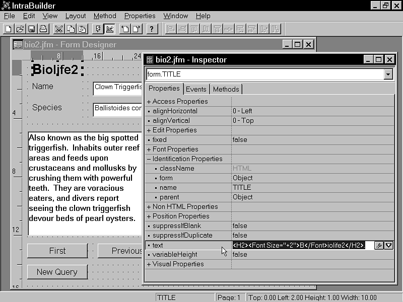
Now that your form's buttons are set up, you're ready to move on to some of the less critical aspects of the form. In this section, you'll establish a title for the form, the colors and fonts used for the form's labels, and a background bitmap for the form itself.
Begin by clicking the form's background and then selecting its title property in the Inspector. Set the form's title property to Biolife2. Next, drop an HTML component onto the form and position it in the upper-left corner. Size the control so that it forms a vertical rectangle to the left of your label components. Set its name property to TITLE. Next, set its text property to the following string:
<H2><Font Size="+2">B</Font>iolife2</H2>.
| NOTE |
IntraBuilder includes many properties on HTML controls that are not currently supported in Netscape Navigator or Internet Explorer. For example, the rotate property allows you to rotate text. The rotation only takes effect when running with the IntraBuilder Designer. |
Specifying the title component's text property using an HTML H2 tag (rather than keying in literal text) gives you more control over the appearance of the label. In this case, you have increased the size of the first character of the Biolife2 label by two points in order to make it stand out. Figure 3.20 illustrates what your form should look like thus far.
Figure 3.20 : Your form as it appears with an HTML title.
Now that your form's title component is established, you're ready to set the color and font scheme that you want the form to use. Select Layout|Set Scheme. Just as when you constructed a new form using the Form Expert, you're able to set the colors and fonts of the items on the form, as well as the background bitmap of the form itself, in one easy step. After the Set Scheme dialog box appears, select one of the built-in schemes, then click Apply, followed by OK. Figure 3.21 shows what your new form might look like if you apply the Oceanographer scheme.
Figure 3.21 : Applying a color and font scheme to the form.
| NOTE |
The background bitmap that you select here is a small JPEG file that is automatically replicated to fill the height and width of the displayed form. Your forms will load faster because backgrounds are synthesized at the client rather than downloaded as large graphics. |
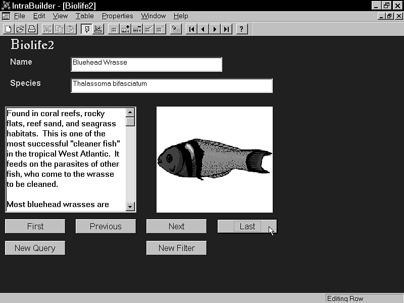
Your new form is now complete. Click the Save button on IntraBuilder's standard toolbar to save your work before proceeding. After your work is saved to disk, click Run on the toolbar to run your new form. Figure 3.22 approximates what you might see.
Figure 3.22 : After you've completed a new form, you can run it by clicking the Run button.
Now that you've learned the "ins and outs" of dropping components to create IntraBuilder forms, let's explore IntraBuilder's Component Palette to see what controls are actually available to you.
Although some components are available only under certain circumstances, there are a number of controls that are always available when you're designing forms. You'll find these components on the IntraBuilder standard toolbar. The next few sections list the components on the standard toolbar and the purpose of each one.
Button components enable you to set up specific actions to occur when an area of the form is clicked. You can set the label (or bitmap) that is displayed on the button's face, and you can set the action that is to occur when the button is clicked.
CheckBox components enable you to provide the user with the ability to select True or False type values. They can also be used to select multiple items from a list of choices. For example, you might use CheckBox components to enable a user to select what items (from a small list of fixed choices) he or she wants to order. You can set the label that is to appear on the CheckBox as well as the action that is to occur when it's clicked. You can also set the component's datalink property to specify the table field the component will display/modify.
Radio components enable you to prompt the user for a single choice from a list of alternatives. Just like the pushbuttons on old car radios (thus the name), selecting one button deselects all others. You can set the label that appears on the control as well as its underlying data field.
The Rule component is used to display a horizontal line on a form. It usually serves to break a form visually into smaller segments. You can adjust the thickness of the line via the component's size property.
TextArea components enable you to display/edit text of virtually any size in a scrollable window. You can configure a TextArea component's underlying data field via its datalink property, and you can set the text it displays via its value property.
The Select component is analogous to the standard Windows combo box control. It enables you to make a selection from a list of items by clicking a list to display it and then clicking an item on the list. You can set its underlying field via its datalink property, and you can specify the items that it lists via its options property. For example, if you want to create a simple three-item list, you might specify the following value for the option property: array {"one","two","three"}. This would cause the entries one, two, and three to appear in the list displayed by the component.
The Text component enables textual data to be entered and displayed. When you dropped field components from the Field Palette onto the new form you built in today's lesson, IntraBuilder actually placed Text components onto the form and linked them to the fields in your Field Palette. That is, you didn't actually drop separate field components onto the new form, even though IntraBuilder gave the illusion of that happening. Instead, IntraBuilder created Text components configured so that they referenced your fields.
You use the Image component to place graphics on your Web page
forms. These can either be static graphics that you set up at
design time, or can be dynamically linked to graphics fields in
database tables. You can also set up Image controls that perform
special functions when clicked-as an alternative to standard text
and button controls. IntraBuilder supports a number of different
graphics formats. Table 3.2 lists the supported formats.
| Abbreviation/Extension | Description |
| BMP | Bitmap |
| EMF | Enhanced Windows Metafile |
| EPS | Encapsulated PostScript |
| GIF | Graphics Interchange Format |
| JPEG, JPG | Joint Photographic Experts Group |
| PCX | PC Paintbrush |
| TIF, TIFF | Tag Image File Format |
| WMF | Windows Metafile |
| XMP | X-Bitmap |
Note that IntraBuilder converts graphics formats that are not typically supported by Web rowsers (BMPs, for example) to the GIF format (the most popular Web graphic format) before sending them to the browser.
The Reset component is used to clear a Web page form of user input. By including a Reset button on a form, you provide a way for a user to clear the entries he's made and start over.
You use the Password component to enable the entry of hidden text. This component is usually used with passwords and login-type information. It's virtually identical to the standard Text control with the exception that, when characters are typed, it displays asterisks rather than the characters themselves. Note that, as with Text components, you can link Password components to table fields.
A JavaApplet component consists of a resizable area on a form (similar to a graphic) in which a Java applet can be implemented. Java applets are programs written in Java, Sun Microsystem's object-oriented, platform-independent programming language. When a Java-compatible browser jumps to a Web page containing a Java applet, the applet's code is downloaded from its location on the Internet to the browser and executed. This enables Web pages to break out of the page orientation of the World Wide Web, to an extent, and behave more like "real" applications.
Follow these steps to add a JavaApplet component to a form:
You use the Hidden component to store a value in a Web page's header and return it to the server. This value can consist of just about anything and is not seen by the user. It travels to the Web server when the form is submitted.
The ActiveX object is a container for Microsoft's multilanguage scripting technology and is very similar to Java applets. Though ActiveX is touted as being language independent, Web pages that use ActiveX controls will run only under Microsoft's Internet Explorer and its Windows 95 and Windows NT operating systems. So, though it may be language independent, it's still very much platform dependent.
Follow these steps to add an ActiveX object to a form:
The SelectList component is similar to the standard Windows listbox control. It enables you to make a selection from a fixed list of items. You can set its underlying field via its datalink property, and you can specify the items that it lists via its options property. You can configure whether the control enables multiple items to be selected via its multiple property, and you can access the component's selected item(s) via its selected array property.
The HTML object is used to place text on a Web page form. Full HTML tag functionality is included, as are support for font and color settings and links to other pages.
The next set of components to examine are those having to do with databases. You use Data Access objects to include data on your forms and configure the form's interaction with its underlying database objects.
The Query component is your chief means of linking database tables with IntraBuilder forms. Using its sql property, you specify the tables and columns you want available to your form. Then, after you've opened the Query (by setting its active property to true), you can drag the fields returned by your Query from the Field Palette onto a form.
You have three options for setting up the sql property. First, you can key your SQL code right into the property in the Inspector. Second, you can load an SQL script file (.SQL) from disk. Third, you can load a Query Builder file (.QRY) from disk (or use the Query Builder to create a new one on-the-fly).
If you elect to use a Database component on a form, you can reference it via the Query component's database property. Click the database property's drop-down list to select from the list of available Database components.
Though it's optional, by making use of the Database component in your applications, you have greater control and more flexibility with your forms' database access. Because Query components can't reference remote databases directly (such as Sybase, Oracle, and so on), you'll have to include a Database component if you wish to access them. Also, including a Database component enables you to use several advanced database features such as cached updates, index creation, and table duplication.
The Session object is also optional, but making use of it in your forms enables you to place each user of your page on a separate thread. This is useful for ensuring that record locking works properly. After you've set up a Session object, you reference it from a Database component. The Database object, in turn, is referenced by a Query component. The net result is that each user's entire chain of database access occurs on its own thread.
Today you learned to create forms automatically by using the Form Expert, and manually by using the Form Designer. You learned about the relationships between the various objects, as well as how they interact on live data forms. You also took a brief tour of the IntraBuilder Component Palette.
| Q: | Can forms that have been generated via the Form Expert be modified in the Form Designer? |
| A: | Yes, forms built using the Form Expert are normal forms, just like the ones you build from scratch. |
| Q: | How do I make a Query component a form's default datasource? |
| A: | Set the form's rowset property to reference the Query component's rowset property. |
| Q: | Is it necessary to include a Database component in order to access databases? |
| A: | Only client/server and ODBC-based databases require that you include a Database component on your forms. Local files (Paradox and dBASE tables) can be accessed directly from the Query component. |
| Q: | What if I want to simply key in a few HTML tags? What component should I use? |
| A: | Use the HTML component. Rather than keying straight text into its text property, type your HTML tags instead. |
| Q: | Can IntraBuilder use graphics file formats not supported by Web browsers? |
| A: | Yes, all formats not traditionally supported by Web browsers are converted to the Graphics Interchange Format (GIF) before being sent to the browser. |
The Workshop section provides questions and exercises to help you get a better feel for the material you learned today. Try to answer the questions and at least think about the exercises before moving on to tomorrow's lesson. You'll find the answers to the questions in Appendix A, "Answers to Quiz Questions."
Add some additional objects to the forms you designed today. For example, you might add a Rule control to the Biolife2 form to separate your data entry fields from the form's buttons. Another fun thing to try might be to add a Java applet to your new page. You can find several of these at http://java.sun.com/java.sun.com/applets.


